


We’re excited to reveal the new Flyhomes logo and colors! Huge THANKS to our designers for working literally around the clock to refine our new look, and our tech team for doing the same to bring it to life on our site and beyond.
To celebrate our new look, we’re sharing the story behind the new logo as well as the history of the original logo and our name itself. Eagle-eyed readers will notice that we’re also switching to Flyhomes from FlyHomes, a natural extension of our new logo.


")
—
Back in the Day (2015)


A few fun facts:
- This is the first logo change since we became FlyHomes in 2015
- Our founders, Steve and Tushar, were in business school together when the company was named and the original logo was commissioned
- Most of the original brand creation happened between Steve, Tushar, a group of friends and classmates, and a survey
- The name Flyhomes was the #2 most liked of the options on the survey . . . and the #1 least disliked
As they were deciding on a name, Flyhomes was much more than the least-disliked name Steve and Tushar considered. The word fly describes our quick working speed and the awesome feeling of owning a home you love. It’s a positive, upbeat, and fun word—all qualities we bring to the process of buying and selling homes. We also associate flying with nests, a metaphor for the security and comfort of home. Plus, it wasn’t too long after naming the company that we started offering airline miles—actual flying—as a reward to home buyers.
Once the name was settled, Steve and Tushar commissioned a logo, reviewing a variety of options and collaborating until the final logo was nailed. Playing so well with the name, the paper airplane theme was the winner. Our look for the past three-plus years could have been very different!


—
The New Look


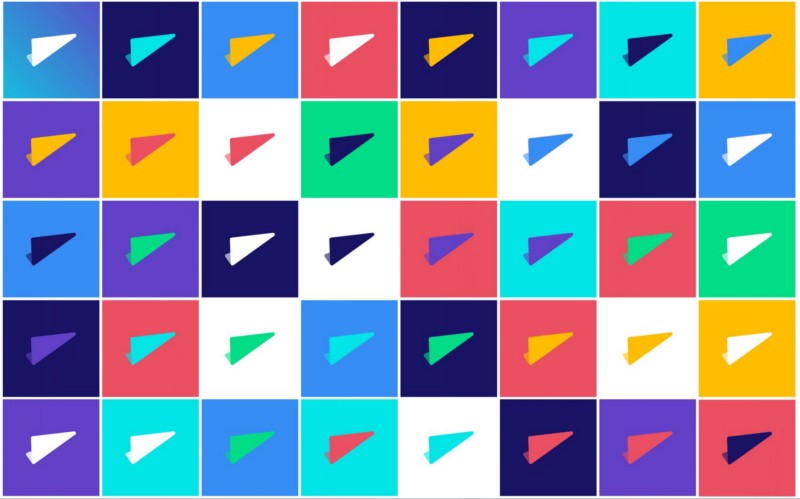
Our new logo features squared design with rounded corners. This approach reflects the huge decisions we help clients make every day—real estate is serious, and the squared shapes with a heavier weight help ground our new logo. We also celebrate with clients every day—that sense of fun is reflected in the rounded corners and lowercase letters. And we can’t forget the paper airplane! It’s still flying, and still means speed + awesome homes.
The icon version of our logo is an evolution of our original airplane icon.


Our designers started by brainstorming oodles of options, then whittled the group down to a final set. The team asked a variety of people for feedback both digitally and in person to account for how a logo can come across differently in the real world and online. Finally, our designers refined the final pick and built out applications across web, apps, and printed collateral.

Colors! Our new colors are inspired by the seasonal colors in Seattle, home of the Flyhomes HQ. We’re going to play with these colors! Every client we work with is an individual and we love the idea of giving a different pop to different people.


We’ve got shapes, too! Our designers developed a system of geometric circles, squares, triangles, and waves to help us tell our stories and our clients’ stories.


Thanks for sharing our excitement over the new look. We’re thrilled to reveal it and to finish out the year with this fresh feel.